How to Create a Website That Sells? Complete 2026 Guide
Got a website but no inquiries? Find out what's blocking sales and how to fix it - from strategy to technology. A practical step-by-step guide for 2026.

Do you have a website but hardly any inquiries? Or are you just planning to create one and want to make sure it won't be just another "pretty business card" that sells nothing? If so - you're in the right place.
In practice, this often looks like this: a company invests time and money into a website, everything "works," the design looks nice... yet customers still don't call. The site exists, but it doesn't support sales. It's a cost, not a business tool.
The problem rarely lies in a single element. Usually, it's a combination of lack of strategy, poorly structured content, copywriting that talks about the company instead of the customer, and technology decisions made blindly. The result? Users land on the page, glance around, and leave.
Research by Nielsen Norman Group shows that users decide whether to stay or leave a website within the first 10-20 seconds. And according to HubSpot data, pages with a well-thought-out CTA generate 202% more leads than those without a clear call to action.
This guide was created to walk you step by step through the entire process of creating a website that actually works - from strategic thinking, through content and UX, to technology and the decision: do it yourself or hire professionals. No technical jargon, just real project examples.
Whether you're planning your first website or looking to fix your current one, you'll learn what really impacts sales and what is merely a decorative addition that looks good in a portfolio but doesn't deliver results.
What a Sales-Driven Website Is (and What It Isn't)
Many people confuse aesthetics with effectiveness. A "pretty" website doesn't always mean a website that generates sales. You can have elegant animations, beautiful photos, and designer fonts, yet visitors leave without contacting you or making a purchase. That's why it's worth defining upfront what a website that truly sells looks like.
A sales-focused website is a tool whose primary goal is conversion. It's not just about looking good - it guides users step by step toward taking action: signing up for a newsletter, filling out a contact form, or buying a product. Every element, from headlines to CTA buttons, should be designed with the user's needs and buying journey in mind.
In practice, there are common myths that block a website's effectiveness:
Myth 1. Beautiful design = sales.
Attractive design grabs attention, but by itself it doesn't generate clients. Read more in "Why a Beautiful Website Doesn't Sell".
Myth 2. A website is just an online business card.
It's not a static catalog of information - an effective site interacts with users, guides them, and answers their questions.
Myth 3. Every element must be "wow."
Overloading content or visual effects can distract users and reduce conversions.
The role of a website in the sales process is often underestimated. It's not just where clients check your offer - it's an educational stage, building trust and demonstrating professionalism. Imagine a client searching for design services: a well-structured website addresses their doubts, shows relevant work, and naturally leads to contact. In this way, the site becomes an integral member of the sales team, not just a "pretty online brochure."
To actually drive sales, a website must include specific elements that support conversion and usability. If you want to know what MUST be included on an effective website, check out "Key Elements of an Effective Website in 2026".
How Users Make Decisions on a Website (Psychology and UX)
Business owners often judge a website based on personal taste - colors, images, fonts. Meanwhile, the decision to contact or buy is made by users based on their needs and experiences. An effective website is created when design and content are tailored to the visitor's psychology, not the owner's preferences.
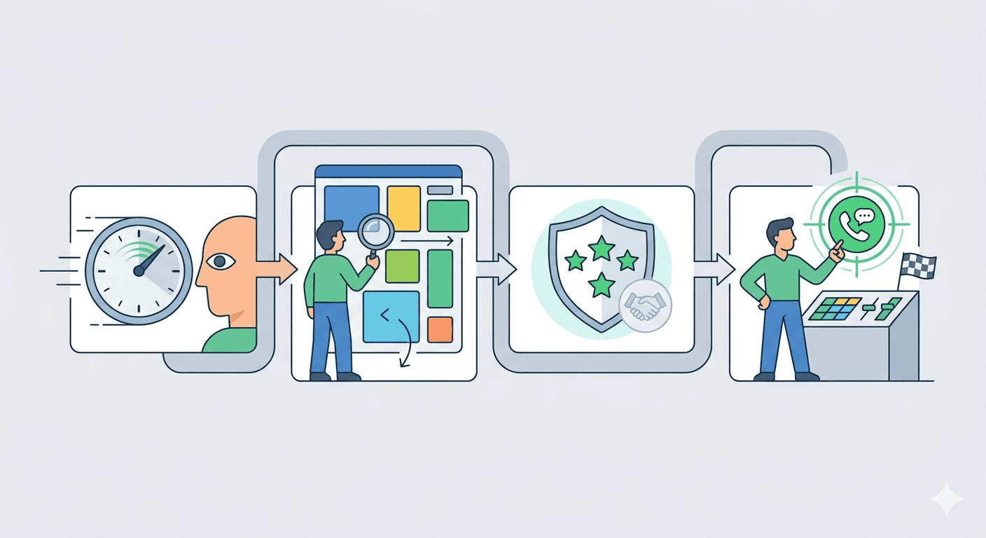
User Decision Path (From Entry to Contact)
First 5 Seconds
Users decide within seconds whether to stay on a website. Headlines, opening lines, and visual accents must clearly communicate value and topic. Example: a client visiting a design agency's site immediately sees "We create websites that boost sales" rather than a vague slogan like "Your business partner."
Scanning Content
Most people don't read word by word. They skim headings, lists, and highlighted text. Key information should be easy to spot, and text should be divided into clear sections.
Building Trust
Customer reviews, portfolio, and certifications serve as social proof. Mini scenario: a user checks projects similar to their industry and quickly evaluates the company's competence.
Decision Moment
After scanning and evaluating trust, it's time for action: filling out a form, calling, or purchasing. Clear, prominent CTA buttons guide users from decision to action.
Common Reasons Users Leave a Website
Chaos
Pages overloaded with animations, sliders, or too much content confuse users and cause immediate exits. Minimalism in design and content increases browsing comfort.
Lack of Clarity
Users don't want to guess what a company does or what benefits it offers. Content must clearly answer "What's in it for me?" and "Why this company?"
Lack of Trust
No reviews, no portfolio, no contact info - all this makes users hesitant. Even small elements, like a visible phone number or SSL certificate, build confidence.
Unclear CTA
If users don't know where to click or what the next step is, they leave. A "Contact Us" or "Request a Quote" button should be visible and repeated logically throughout the site.
Remember that responsive design directly impacts user comfort on mobile devices and tablets - more in "Responsive Website Design - What Does It Mean in Practice?".
How to Create a Website That Sells: Start With Strategy, Not Design
Many entrepreneurs think that creating a website starts with visuals, colors, and layout. In reality, every effective website starts with a strategy. This stage determines whether your site will be a sales tool or just a pretty business card.
Defining the Website's Goal
Before the design is created, it's important to clearly define what the website is meant to achieve. Goals can vary:
- Lead generation - collecting contacts of potential clients through forms, newsletters, or downloadable materials.
- Service sales - directly guiding users to purchase or book a consultation.
- Brand building - demonstrating professionalism, experience, and the company's value in the industry.
Each of these goals requires a different approach to content and UX design. A website cannot be "everything to everyone" - its job is to support the main business objective.
Identifying the Ideal Website Visitor
It's not enough to know what your company does - you also need to understand who you want to attract. An ideal client analysis includes:
- Needs - what problems the user wants to solve and what benefits they seek.
- Objections - what might prevent them from contacting or buying.
- Communication style - how the client talks, and which words and tone build trust.
For example, if your website targets small shop owners: the language must be simple, the benefits immediately visible, and the contact process extremely intuitive.
The Role of the Website in Sales
A website can serve multiple functions in the sales process:
- First point of contact - the website is often the first interaction a user has with your brand.
- Sales support - it presents the offer in a way that facilitates follow-up conversations or consultations.
- Automated inquiries - forms and CTAs collect data and respond to interest even when the salesperson is busy.
Website Structure That Sells
A well-planned website structure is essential for conversion. It's not just a content map - it's a tool that guides users logically through information and decisions. A site without thoughtful structure can feel chaotic, even if it looks attractive.
Essential Pages
Every sales-focused website should have a clear set of pages serving specific purposes:
- Homepage - makes the first impression and communicates the value of your offer. Users decide here whether to stay.
- Offer/Services - detailed presentation of products or services with clear benefits.
- About Us - demonstrates expertise, experience, and builds trust.
- Contact - an easy way for users to get in touch or submit inquiries.
- Additional pages - FAQ, blog, or case studies help address doubts and support SEO.
Each of these pages requires well-thought-out content - and that also affects the project budget. Check what the current pricing for website creation in 2026 looks like. For more on what a small business website should include, see "What Should a Small Business Website Include?".
Connecting Structure to Conversion
Structure alone does not guarantee sales - it must align with user behavior. The order of sections should naturally lead from introduction to decision, and all pages should support the main goal. In practice, this means:
- Logical placement of content that answers user questions step by step.
- Internal linking between pages to facilitate navigation and increase time spent on site.
- Placing CTAs on every page, so users always know the next step - whether it's contacting you, downloading materials, or ordering a service.
Not enough time to implement all of this yourself? See how working with SN Solutions looks - free consultation, quote within 48h. Book a consultation
Website Content - How to Write to Sell and Rank
Website content is more than information about your company or products - it's a sales and SEO engine in one. Well-written content helps users make decisions while increasing visibility in search engines. A site without thoughtful content may look appealing but won't generate leads or attract organic traffic.
Benefit-Oriented Language Instead of Company Description
Users aren't interested in the fact that your company has been around for 10 years or has a modern office. They want to know what's in it for them. Instead of describing your company, focus on benefits: how your product solves problems, what results your service delivers, and what experiences clients will gain.
Example: instead of "We offer professional web design," write "Your new website will attract clients and boost sales within 3 months."
SEO vs Sales - How to Combine Them
There's often a perceived conflict between SEO-focused content and sales-focused content. In practice, they can and should go hand in hand. Content should naturally include relevant keywords while remaining understandable and engaging for users. It's also worth knowing whether SEO in 2026 is still worth it - the answer might surprise you.
Key Places for Sales Content
Not all content is equally important - key areas include:
- Headlines and leads - the first sentences must clearly communicate value.
- Offer/service pages - detailed arguments and benefits with prominent CTAs.
- About Us and portfolio sections - build trust and authority.
- Blog and FAQ - support SEO while addressing client objections.
To dive deeper into creating content that sells and ranks, read "How to Create Website Content That Sells and Ranks in Google".
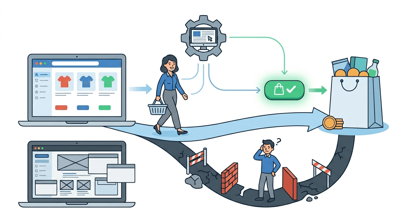
Design and UX - How Visuals Influence Buying Decisions
Website design is not decoration - it's a tool that affects brand perception, user trust, and purchasing decisions. Even the best content can go to waste if the visual structure doesn't support conversion.
What "Good Design" Means in 2026
Today, good design is primarily about clarity, consistency, and intuitive navigation. Users should know where to find information while feeling the company's professionalism. Example: a minimalist layout with highlighted CTAs allows users to quickly find key information and naturally take action. Design supports decisions, not just attention.
Common Visual Mistakes
Companies often make the same mistakes:
- Too many visual effects - animations and sliders distract from content and CTAs.
- Lack of information hierarchy - users don't know what's most important.
- Unreadable text - small fonts, poor contrast, or long paragraphs discourage reading.
Read more about why aesthetics alone are not enough in "Why a Beautiful Website Doesn't Sell".
Mobile-First and Responsiveness
More users are browsing on mobile devices, so mobile-first design is essential. A responsive site adjusts layout, images, and CTAs for different screens, directly impacting user comfort and conversion. Learn more in "Responsive Website Design - What Does It Mean in Practice?".
Responsiveness is not everything - page loading speed is equally important, measured by Google through Core Web Vitals. See how they really affect SEO.
Website Technology - CMS, WordPress, or Custom Solution
Many business owners approach website technology with caution - "I don't know this stuff" or "Will it break?" In reality, choosing the right content management system is a strategic decision that affects usability, updates, and scalability.
CMS - What It Is and When You Need It
A CMS allows you to update your website without programming knowledge. You can add articles, change images, or update offers easily. It's particularly useful if you plan regular publications or want to manage content yourself.
WordPress vs Custom Website
WordPress is the most popular CMS globally, flexible and user-friendly, with countless plugins and themes. A custom website is built from scratch, tailored to your business needs, giving full control over functionality and a unique design.
| Criterion | WordPress | Custom Website |
|---|---|---|
| Initial Cost | Lower (few to dozen thousand PLN) | Higher (dozens of thousand PLN) |
| Implementation Time | Faster (2-4 weeks) | Longer (4-12 weeks) |
| Ease of Updates | Very easy, intuitive panel | Requires technical support |
| Flexibility | High, thanks to plugins | Maximum, any functionality |
| Security | Requires regular updates | Higher, custom-coded from scratch |
| Scalability | Limited for high traffic | Full control over performance |
| Uniqueness | Limited by themes | Fully unique |
| Best For | Small/medium businesses, blogs | Large companies, specific requirements |
You can find a comparison of both solutions in "WordPress or Dedicated Website - Which One to Choose?".
Choosing Technology Based on Your Business
Technology choice should reflect business goals and website management approach:
- Small businesses or startups often benefit from WordPress - faster, cheaper, and easy to update.
- Companies with complex offerings, specific processes, or security requirements may need a custom website.
- Future-proofing is crucial - consider ease of adding features, integrating systems, and scaling the site.
DIY Website vs Hiring Professionals - What Really Pays Off
Deciding whether to build a website yourself or hire professionals is a key moment for any business owner. It's important to approach it wisely, considering your capabilities and potential risks.
When DIY Makes Sense
DIY is feasible if you have:
- A limited budget and simple needs - e.g., a small business card site or blog.
- Time and willingness to learn the basics of a CMS, WordPress, or website builder.
- Minimal functional requirements and a small number of pages.
In this case, creating the site yourself can be quick and satisfying. More in "Is It Worth Building a Website Yourself?".
When Hiring Professionals Is Better
Professional website development pays off when you want:
- A site that actually drives sales and supports your business.
- To avoid common design and UX mistakes that discourage users - read more in "The Most Common Mistakes in Website Creation".
- Integration with systems, process automation, and future scalability.
It's also worth knowing what to look for when choosing a specific contractor - freelancer or agency, which is more cost-effective?
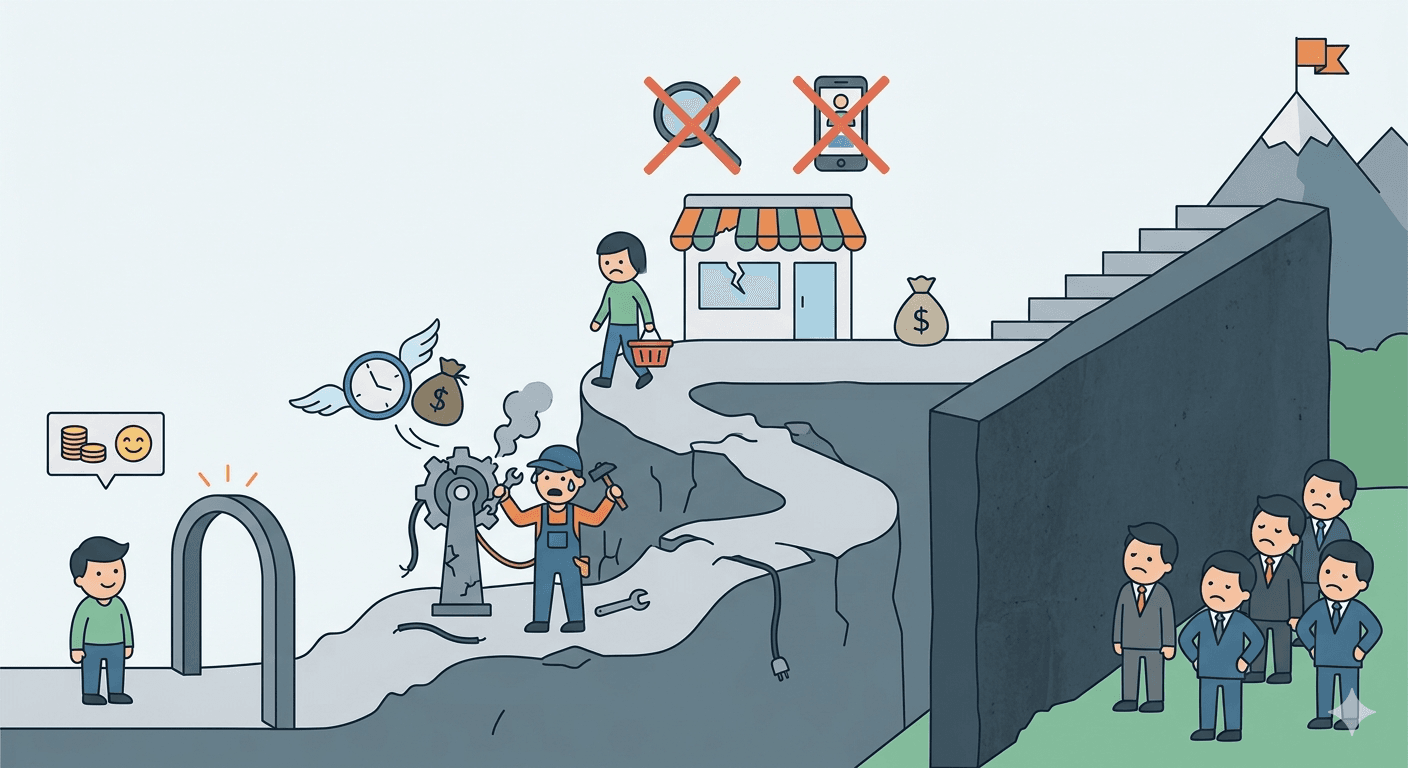
Hidden Costs of "Cheap" Solutions
Low initial cost can be tempting, but often comes with:
- Frequent fixes and DIY debugging.
- Lack of SEO and UX optimization, limiting sales.
- Functional limitations that hinder business growth.
How Long Does It Take to Build a Website and What Affects the Timeline
One of the most common questions from business owners is how long it takes to create a website. The answer isn't straightforward - it depends on project scope, client decisions, and available materials.
Key Stages of the Process
Website creation can be divided into several key stages:
- Planning and Strategy - defining goals, structure, and target audience.
- UX and Design - creating layouts, visual concepts, and prototypes.
- Content Creation and Implementation - preparing copy, graphics, and coding the site.
- Testing and Optimization - checking functionality, responsiveness, and final adjustments before launch.
Each stage takes time, and rushing the process often compromises quality.
Typical Timelines
Small business card websites usually take a few weeks, while larger corporate sites or e-commerce stores can take several months. In practice, the deciding factors are not just hours worked by specialists but how efficiently the client provides materials and decisions.
Impact of Client Materials and Decisions
Lack of prepared content, images, or functional decisions can significantly delay the project. If a client doesn't provide all service descriptions and graphics upfront, the project can be extended by several weeks even if the technical work is fast.
More details can be found in "How Long Does It Take to Create a Website and What Does It Depend On?".
Common Mistakes That Prevent a Website from Selling
Even the best product or service won't sell if the website doesn't support the buying process. Most problems stem from a few recurring mistakes.
No Strategy Sites created "quickly" often lack a clear goal. Without a defined target audience, conversion goal, or user journey plan, the site becomes chaotic and fails to drive contact or sales.
Content Overload Too much text, images, or visual effects confuses users. Instead of attracting attention, it distracts and slows down decision-making.
No CTA Without a clear call-to-action, users don't know what to do next. Even a great offer can be overlooked if there's no visible "Contact Us" or "Request a Quote" button.
Lack of SEO and UX Optimization A site not optimized for search engines won't attract organic traffic. Poor navigation and non-responsive design discourage users before they reach valuable content.
More about common mistakes in "The Most Common Mistakes in Website Creation".
FAQ - Common Questions About Website Creation
How much does a sales-focused website cost?
Cost depends on functionality, number of pages, content quality, and design. A simple business card site may cost a few thousand PLN, while a fully-featured corporate site with custom design and sales functionality can cost tens of thousands. Investing in a professional website often pays off faster than saving on a cheap, amateur project.
How long does it take to build an effective website?
A standard business card project takes 3-4 weeks, a site with a blog and more complex structure takes 5-8 weeks. Timelines extend when client materials are missing - photos, copy, logo. It's worth starting to gather these before you commission the project.
Is WordPress suitable for a service business?
Yes - WordPress is a flexible CMS that allows quick setup, easy content updates, and integration with marketing tools. It's especially convenient for small businesses. For more complex projects or custom functionality, a dedicated solution may be better.
Does a website generate clients automatically?
No - a website is a tool that supports sales. To generate leads, it must be optimized for UX, include sales-focused content, and have clear CTAs. Combined with marketing and SEO, it becomes an effective client acquisition channel.
When does a website start generating leads?
It depends on the traffic source. With Google Ads - first inquiries can appear within a week. With organic SEO, first results show after 3-4 months, stable results after 6-12 months. A website with no traffic source won't generate leads on its own.
Do I need to know SEO to have a website that ranks?
No - but you should know what matters and make sure your contractor takes it into account. The minimum standard: correct meta tags, H1-H3 headings, loading speed under 3 seconds, and mobile responsiveness.
Does SEO need to start from day one?
Starting SEO early increases the chance of organic traffic. Even a well-designed site without SEO can work locally or via paid campaigns, but SEO from the start helps gain visibility faster and supports long-term sales.
Summary - How to Approach Website Creation Without Wasting Money
Creating a website that actually sells is a strategic process, not just an aesthetic one. Every decision - from technology choice to UX design, content, and CTAs - impacts the site's effectiveness and ROI.
Key takeaways from this guide:
- Strategy is the foundation - define the website's goal, target audience, and its role in sales.
- Content and UX work together - benefit-driven copy, logical structure, and intuitive navigation are as important as design.
- Technology must support the business - CMS, WordPress, or custom solutions should match your company's needs and growth plans.
- SEO and speed are not optional - a website invisible on Google that loads slowly on mobile loses customers before they even read the offer.
If you want a website that supports sales and attracts clients from day one, see how our website creation process works step by step.
Related articles

Website for Electricians and Plumbers - How to Get More Jobs from Google
What should a trade website include? How to rank in Google Maps and win more jobs from search? A practical guide with specific steps for electricians and plumbers.

Physiotherapy Website & SEO Guide: Get More Patients from Google
What does a physio clinic website actually need - and how do you rank on Google in 2026? A practical guide to SEO for physiotherapists.

Website or Google Maps Listing? What Local Businesses Actually Need in 2026
Limited budget, limited time - website or Google Business Profile first? An honest answer with real arguments, a clear priority order, and an action checklist.